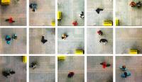
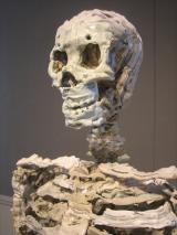
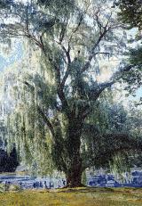
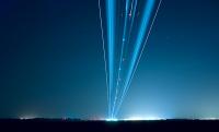
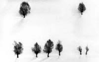
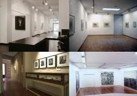
In a couple of weeks I will expose a selection of my photos from Antarctica in Fotogalerie im Blauen Haus, a gallery dedicated to photography that is located in Munich. Germany.
You can visit the exposition from February 18th to March 26th 2011 (Tuesday-Friday: 3pm to 7pm and Saturday 11am to 4pm). If you want to talk a bit about Antarctica heard some of the anecdotes from my trips, or just meet me, I’ll be present for the opening on February 18th 2011 starting from 7pm.
This is the address and contact informations of the gallery:
Fotogalerie im Blauen Haus
Schellingstraße 143
Ecke Schleißheimer Straße
80798 München | Maxvorstadt
Phone: 089 – 700 969 44
[email protected]
www.fotogalerie-im-blauen-haus.de
I’ll expose a total of 26 photographs from my trips to Antarctica, for the biggest part they are among the most abstract and minimalistic pictures I shoot on the white continent. For more informations about my travel to Antarctica and this series of photographs you can have a look to the article I wrote some months ago: Physics, adventure, poetry and photography in Antarctica.
I prepared a poster with several maps of my trips to help visitors locate my pictures. The version displayed on this page is quite small, but if you are interested you can download a bigger file (0.8Mb): Antarctic Map.
Concerning the prints, I’ll expose eleven 30x45cm edition of 15, eleven small 8x12cm edition of 15, two 50x75cm edition of 9 and one panoramic 23x82cm edition of 15. All the photos have 5cm of white paper all around the image, signature and edition number is on the back lower white margin. The photos are museum archival inkjet prints on a really beautiful paper: Photo Rag Baryta by Hahnemühle. It looks like the semi-lucid fiber paper traditional baryte paper used in the darkroom (actually it really contains a layer of baryte).
If you like my work in Antarctica please tell your friends about the exposition. Feel free to reuse all the images on this page. Thank you very much and hope to see you soon in Munich.
]]>Waiting for the photo gallery and a more detailed report, there it is a little animation showing us inside the infinite cube city.
]]>
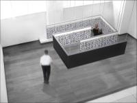
Last week I finally put online some files of the photos infinite palaces and buildings from my series of repetitive elements. Photos on which I worked for more than one year and that I have repeatedly cited writing on this blog. At the same time I published on Camera Obscura a brochure showing one of the installations that can be made starting from these giant photographs of buildings.
This is Infinite Cube City (pdf, 2.0Mb), a cube of 3m where the walls are built precisely using a photo of the series: the palace near Place d’Italie.
ICC (Infinite Cube City) is an artistic installation proposing an experience of contemporary and future urban space. In a completely neutral room there is a hung volume which generates a labyrinthine symmetrical path. A huge photograph of a building, taken from the project “Repetitive Elements” (RE) by Fabiano Busdraghi, is applied on the walls of this volume.
The viewer can walk into this labyrinthine space that looks towards infinity and is immersed in a three-dimensional reconstruction of a city completely equal, consisting of a single building whose elements are all equal and repeated indefinitely.
In the brochure, in addition to the description, illustrations and technical design, you have a short statement on ICC but also on the infinite places series in general.
]]>
I just got back from a week in Barcelona dedicated to the research of a contemporary art or photo gallery that can represent me in the Catalan. It was my first time ever in Barcelona, therefore I had to learn something about the city, understand where expositive center and galleries were located, appreciate the atmospheres and taste the districts. This article is a resume about the experiences made last week that can be used to prepare an itinerary for those who are searching for a space to expose or for those who simply wants to visit art and photo galleries in Barcelona. The emphasis, because of my motivations, is posed on photo or contemporary art galleries that are potentially interested to bet on young photographers.
Where to find art galleries in Barcelona
The majority of the contemporary art galleries of the city are found in the district Eixemple, north west of the Catalunya Place.
The galleries are concentrated along c. Consell de Cent, between the Rambla and c. Aribau. Therefore you can find them everywhere also in c. Aragò, Valéncia, Enrique Granados, Balmes and in the pl. Latamendi. They’re numerous on the streets in the nearby: c. Diputacio’, Rossello’, Provença and Mallorca. In this entire zone there’s something like fifty galleries, sometime literally one near to each other, mostly in c. Consell de Cent.
L’Eixample is a modern and dynamic zone, plenty of restaurants and bars, some new and kind of high tech, typical of the aseptic milieu of businessmen. It is a neuralgic and frequented zone, even by tourists, as it is not far away from the center, near to the Rambla and the Battlò House. The streets are jammed and the foot way crowded. The houses are modernized, well-kept and rich. Well, it is a high level and modern district. The sensation that I had is that the galleries in this district are the one that expose the most contemporary art, who bet on the new artist, on the innovative idea; inside those streets the actual history of art in Barcelona is written. Obviously, there are also galleries that expose works of well-known artists, more classic works and occasionally antiquity.
In the historical center the galleries are grouped inside 2 streets: c. Petritxol in the Barrio Gotic, c. Montcada at La Ribera. Around the Museum of contemporary art there is something else. Except one or two exception of superb galleries, the ones of the center are real institutions/museum where it is impossible to expose if your name doesn’t appear on art books studied at school, or simple shop windows with artistic products sold to tourists. In these last shops, the exposed works are even beautiful, but often conventional. Or there is no real temporary exposition but rather works by several artists to be sold. This gives the idea of a luxury shop more than a gallery that develops contemporary art events, take an artist under its wing and grow up with it. Moreover photographies are virtually absent from the historical center. It is practically impossible to expose in this zone as emerging photographer and probably would not even interesting from the career point of view.
The third zone of galleries goes from the enchanting district of Gràcia to Tres Torres. Galleries here are more spread that in Eixample. Although this, some are concentrated on c. Verdi, some in the triangle between Avinguda Diagonal, Travessera de Gràcia and c. Gran de Gràcia and some around the tube stop Bonanova and near Pl. Francesc Macià.
Personally, even if I do not know the entire city of Barcelona, the streets and lanes of the old town of Gracià are maybe my favorite zone of the city, a place where I would like to live. Here’s an amazing popular and lived atmosphere, antique and shabby houses that remember me about Latin America, long and narrow tree-lined streets. Inhabitants, animated streets, no tourists, gypsies playing under windows begging for money and typical restaurants where menu with starter, pantumaca, first, second, dessert, wine and coffee costs less than 10 euros. Galleries though are isolated and scattered, because the local population is not the typical art buyer and the plausible visitor (or buyer) must move to visit the gallery. Those are the reasons for which, from a commercial and working point of view, it would be better to choose the gallery center inside the Eixample. Nearby Augusta Street, which is more central and animated as it is similar to the Eixample, there are two of the few galleries of Barcelona entirely and uniquely dedicated to photography, thus it’s worth the walking.
Art galleries in Barcelona
Barcelona turned out to be an active and lively city for contemporary art, confirming its fame of city attentive to art and new talents that everyone knows all around the world.
Galleries are concentrated in a couple of zones, which allows the formation of a gallery pole, probably facilitating the possibility of visitors, collectors and professionals beyond vernissages. Galleries are all well visible, on crowded streets and have windows. This is an enormous difference compared for example with Milan, where the majority of the art galleries are unfortunately all hidden. If you don’t know that in Who Knows Who Street n. 33, ringing at the fifth doorbell, opening the door and entering the garden, you would probably never know that there’s a gallery over there. Unfortunately this way the majority of art galleries in Milan are precluded from every occasional visitor.
Another great difference between Milan is the absence of arrogance and sometime even impoliteness that you must face, not in all, but in many galleries of the north Italian city. In Barcelona I’ve always been politely and happily welcomed. In some cases the galleries politics wasn’t to watch works proposed from tyou, but rather the directors choose the artists. Even in this case though I’ve always been respectfully received. In some cases I was asked to send a dossier via mail, sending that gave back some answer and some others are still waiting to be received. The majority of the galleries anyway gave me the opportunity to fix directly an appointment with the director or even show immediately my work, without waiting or going back again.
Welcoming has always been warm, interesting, disposable and even involved. And this is the demonstration of how here gallerists are ready to see what you propose, independently by the fact that they decide to represent you or not. In some cases the discussion was long and the directors gave me advices, encouraged me, opened new possibilities and proposed future meetings.
In the whole, a couple of galleries would start suddenly to expose my works, while some 3 or 4 are potentially interested and the dialogue is still open. But the possibility to be represented are is definitely concrete.
A selection of art galleries in Barcelona
One of the first galleries that I visited along c. Consell de Cent is Manel Mayoral, a beautiful gallery that exposed a wonderful collective of famous contemporary photographers, such as Gabriele Basilico and Candida Hofer. Undoubtably when the shots are made by famous photographers the quality strikes your eyes, the images where absolutely wonderful, without exceptions and it’s something that doesn’t happen quite often walking around the galleries. Perfectly presented, modern ambient, large and elegant, rich and refined, not the simple white and empty room of many galleries. The gallery only exposes works of well-known international artists.
Another beautiful gallery of the zone that exposes photography is Senda. Once again wonderful spaces and interesting works, but their politic as well is not to look at works proposed directly by photographers but rather the direction choose the artists during the international exhibitions.
Two more beautiful galleries along c. Consell de Cent, which expose paintings, sculptures, pictures and installations are Toni Tapies and Carles Taché. In both cases you can’t present your work on site or ask for an appointment, but you must send a dossier via e-mail. In the same street, there were two galleries who were exposing pictures, which are Contrast and Llucià Homs. The first one was hanging little black and white pictures by Martìn Sala, that I personally completely disliked, apart for a couple of exceptions. The other photographers represented in the gallery had interesting works. I particularly appreciated the work of Robert Berlin. The second gallery shown an interesting work: Seven Deadly Sins by Lukas Maximilian Huller, the most impressive work between the ones I saw in Barcelona. For both galleries it is possible to fix an appointment to present your works.
The exhibition that mostly surprised me has been Hot Dreams’ motorbikes exposed in the Gòmez Turu gallery. I enjoyed the idea that those were real sculptures that deserved the honor of being exposed in a contemporary art gallery. Moreover, they’re more beautiful than many other “artistic” objects. They’re perfectly finished and they are also functional objects, objects made not for the art market but for motorbikes lovers, real and concrete objects, for people, objects that have a sense inside. Love them!
This is a perfect example of what I mean when I say that contemporary art suffer of the same problem of unintelligibility and isolation of classical music. They should both follow the example of Jazz at the beginning of the last century or the example of Rock in the 60’s, which completely reinvented the language and the musical universe itself, keeping themselves near to the real world and being perfectly intelligible. Talking about the art dealers, greetings for their courage to bet on such an exhibition like this one.
I also enjoyed 3 punts, José de Ibarra and Mito galleries in the Eixample. The three galleries regularly expose pphotographs and I had the pleasure to talk with all the directors of the three, interested at my work, helpful and open-minded towards me, sometime even prodigal of propositions, advices and suggestions. In Mito gallery there were some sculpture by Brian Dettmer, made deforming and uniting old audio cassettes, that I found simply genial, one of the contemporary art work I mostly appreciated during last months. The last gallery I must suggest for this zone is Adn, which you must send your works via e-mail to receive a quick and kind answer.
Kowasa is one of the few gallery in Barcelona that only expose photography. It is in a certain way an extension of the photographic library at the ground floor (which is supplied with wonderful monographs and pictures books), in which young unknown photographers expose their photos, but in a space that is actually a bookshop more than a prestigious art gallery. The space at the second floor exposes pictures in a classical manner, but these are mostly pictures that are part of the collection, therefore is not easy to expose a personal work.
Among the other expositive spaces that are not part of the galleries center of the city, a particular mention surely goes to Trama. This gallery, situated in a crowded street of the Barrio Gotico, exposed, in a beautiful, elegant and spacious space, some interesting gigantic prints of Aziz+Cucher. It is not possible though to present your work directly to the gallery, it is up to the direction to choose the exposed artists.
I also appreciated a little gallery called Cubo, with a young and informal ambient, music turned on. Pictures has literary texts attached and were sold to low, low price. It is interesting for those who’d like to expose in a space without excessive requests.
Camara Lucida is a gallery that only exposes photography. Beautiful even if it doesn’t have any big space, but many little rooms and a splendid inner court with tables open air. It seems a lively place of exchange, intimate and welcoming. It remembers me of my gallery in Paris, Chambre avec Vues. Instead of a unique volume with a temporary, brief exposition, there are many rooms with images of different photographers, and the space of the exposition that seems to be the one of the moment. Between the exposed works, I particularly appreciated the one of Branislav Kropilak, his Trains series (which I thought about, but never realized it) and Landing series. I think they’re both brilliant and perfectly realized.
The last gallery that only exposes photography is Fotonauta, but it was closed when I walked by because they’re moving into a different location.
]]>
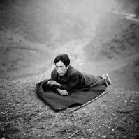
The first European retrospective of Edward Steichen has been presented during the last months of 2007 at the Jeu de Paume in Paris. It was an exhibition I had to visit because, even if I knew the most famous images of Steichen, I barely saw his original works of his first pictorialist years. Moreover, the 450 photos that were part of the exhibition were a sure promise to deepen the knowledge of one of the most prolific and incisive photographer of the last century.
The exhibition starts, as expected, with the first pictorialist pictures of the beginning of the long Steichen career. I deeply looked all the pictures from the technique side, as I am an insider and a printer of antique techniques, even if I didn’t forget the aesthetic side.
The malediction of Ansel Adams
I was suddenly hit by the platinum prints of Steichen. They completely detach from contemporary platinum prints that are all characterized by deep blacks, tonal range as long as a piano keyboard, bright and soft whites, elevated contrast and legibility of shadows, where the separation of tones is always excellent. I do know for my personal experience that it’s not easy to completely brighten high lights, where often a little veil or a warm tone remains, even if that doesn’t take away luminosity to whites. In spite of everything, contemporary platinum/palladium blacks are always the deepest.
The assumption that deepest blacks come from platinum prints is a boast of photographers that use this antique print procedure as one of the platinum most attractive characteristic. In the ambit of fine art digital print, the arrival of new ink generation for printer was nothing short of a news that surprised, as it allows higher dmax than the traditional platinum one. The fact is, platinum and palladium seem to rhyme with darkest shadows, where details remain decipherable, opaque and not lucid shadows, but with an absolutely elevated dmax.
Steichen platinum prints, for example Pool, Milwaukee, all have diametrically opposed features. The darkest shadows of the image never get over a bright grey, without achieving a level that could be defined black. Whites are practically absent, therefore the tonal range is short, pictures are grey and the contrast is missing. Prints seem obtained by negatives developed for prints on fiber paper, highly underexposed on ultraviolet during the printing.
Obviously Steichen was a great printer and the print characteristics do not depend by errors but probably they are a precise aesthetic choice. Looking at all these prints has been an amazing experience and brought me to a series of reflection.
First of all I must underline that having prints with deep blacks and bright whites is not a need a priori. I would willingly call this rule malediction ofAnsel Adams. Probably an unintentional malediction, as Ansel Adams repeatedly sustained the interpretative freedom of each photographer towards its own expressive research inside the dark room.
La previsualizzazione è più precisamente vista come un’attitudine nei confronti della fotografia, piuttosto che come un dogma. Si assume che il fotografo abbia una totale libertà di espressione, in nessun modo ristretta dalla mia idea, o da quella di chiunque l’altro, di cosa sia l’arte.
Ansel Adams
Despite this clear position, there’s no doubt that the invention of the zonal system and the print habits of Ansel Adams extremely influenced generations of photographers. Ansel Adams states that this is his way to take pictures and he only wants to give his apprentices the technical knowledge to express their own sensibility, not orthodoxy on how to print. And yet his never-ending researches on how to obtain the deepest blacks, the clearest whites, the maximum details inside shadows and lights, produced and still produce multitudes of emulous. His personal aesthetic and expressive research has been translated into assumed doctrine as absolute truth.
Evolved amateur photographers seem to be infected by the Ansel Adams malediction, in such a way that they loose sight of the image content as well, sacrificed for the extreme rendering of black and white. Ansel Adams malediction is one of that bewitching that created as much troubles as anything else in photography history, tying expressive creativity and freedom in a formal and standard research of the “best print”. Disciples of Ansel Adams school take pictures that are identical to each other; often they look equal also in the thematic more than the printing characteristics. Photographers of a higher level seem to better exorcise the malediction, at least talking about the excessive details at the end of the tonal range, or the renounce to one of the two extremes, in the lowkey and highkey images. But Steichen prints, where blacks and whites are contemporaneously missing, obtaining flat, gray and less contrasted images, are nowadays the most rare.
Still the research of black and white shouldn’t be an assumption a priori. Photography rules have been invented only for a didactic purpose; it would be appropriate to remember that they should be interpreted as a vade-mecum of causes and effects. Composing the image with a centered subject gives the idea of immobility. Clean whites give the idea of purity. The contrast augments the image drama, pushing its limits means obtaining pure graphical effects. A portrait cut at the neck gives the idea of a decapitated head. And so on; but none of these “expedients” is “wrong”. The first Steichen’s pictures, delicate platinum prints that play on soft gray tones, subtle nuances, almost readable and velvety shadows, all have a particularly sweet and touching atmosphere.
Not only Steichen made me think about black and white as pure and simple stylistic expressive choice, as actually all the characteristics of the photography, but also the characteristics of his platinum prints ridicules the never-ending technical research that aims to obtain a formal perfection on antique print techniques. The continuous research of deepest blacks, maximum details, absence of imperfections and stains is nonsense and a masochism act. The evolution of the photographic techniques always tries to simplify and improve the procedure to get technically perfect, clear, contrasted, prints with a huge tonal range. I think it’s kind of stupid to print with an antique technique, on a hand-made paper and spend months to try to ameliorate it to the point of creating the perfect print, as it would have been printed by a machine. If the expressive choice is the formal perfection in the pure sense of the term, well: let’s print digital! The choice of using antique print procedures is more coherent when the goal is achieve non-conventional images.
In the middle of the pictorialism of the turn of the century
After platinum, the displaying Steichen, une épopée photographique head on with beautiful gum bichromate prints. Absolutely wonderful and perfect, probably the best I’ve ever seen in my entire life. Curiously, blacks are far deeper and prints much more contrasted in relation with platinum. The exact contrary of what is expected. Gum gives black shadows only when lots of prints are overlapped, while with platinum is extremely easy. Rationally, bichromate gum would be used for delicate images while platinum for contrasted images. But Steichen works exactly in the opposite way. This is a teaching for all those who think that each antique technique is destined to a unique type of photography, or even to a unique subject. Each technique can in fact be adapted for every personal exigencies.
One of the bichromate gum I mostly adored is “Self portrait”. I noticed with pleasure that the print interventions weren’t limited to the developing phase. In this print there are several evident, direct and accurate interventions. Steichen actually applied light blows on the palette, the brush, the line on the background and the collar of the shirt, directly adding brush strokes of white color on the picture. They turned out to be some exceptional expressive and technical interventions. A humiliating defeat for those who go on a crusade against digital, sustaining that digital images are not Photography because interventions twist their nature turning pictures into non-photographical images. People should at list stop pretending not to know photography history. Interventions on images, sometime even more radical than the nowadays computer retouching, were born together with photography and were absolutely common at the beginning of last century. Digital didn’t do anything but giving some more tools to photographers.
The overview on antique printing techniques ends with some large-sized carbon prints and some wonderful photogravures. These last are outstanding and I do understand why Steichen and Stieglitz considered them as real printings and not only simply photographical reproduction. Finally, having the possibility to see the real The Pond-Moonlight, that is at the moment the second most expensive picture ever, has been an emotional moment.
Talking about pictures, and not only about technique, almost all the images of the pictorialism are amazing. Some more “beginning of century” type, some despite pictorialism are extraordinarily modern.
The one I like best of Steichen’s early years is Brooklin Bridge. Even if the print is soft and out-of-focus to follow the pure pictorialist style, the subject is already modern and the attitude is up-to-date even nowadays. Its dark and impending shape shot from below, its black bar that goes from the center to the right top, its empty mass of water at the base of the picture, its blinding lights that constellate the dark night. It’s an insolent composition, looking at it from the rules point of view, and a masterpiece on the aesthetic plan.
One of his first portraits I like the most is Gordon Craig, once again for its actuality and the astonishing composition of the image. The study for the cover of the 14th number of Camera Work has been a pleasant surprise. More than the image, I particularly adore the interaction of the subject with the golden frame, that remind me about the Vienna Secession.
The passage to modernism and commercial.
The exhibition goes on with Steichen’s evolution to modernism. Even if I love pictorialism, I must say that the aesthetic innovation brought by Steichen in this second phase is a full-blown breath of fresh air. He discovers the focus; after all the flou of the previous images, pictures are now sharp and neat. Even if images are interesting and often modern, the birth of mode pictures, the most abstract still lives, arouse mostly an historical interest, considered the visual revolution that Steichen operated on his work. It was sometime even an anecdotal interest, as in the case of WWII aerial photos.
Among the pictures of the modernist period I have to talk about a couple of images, which I’ve already known, as they’re my favorite Steichen’s: Maypole and George Washington Bridge. I had seen the first one not long time before at Paris Photo, one of the most expensive of the entire exhibition. Both are genial and actual, perfectly realized and pure direct photography. Those pictures are absolutely valid, for the image and that’s that, and not for all the modifications added after the shooting. Both are famous and used, together with some mode or pictorialist pictures, for the ads that cover Paris to promote the exhibition. I’m a little bit concerned that those kinds of pictures inside the exhibition can be counted on one hand. It is possible to see some floral still life, some shells, abstractions and all of the less-known shoots of the photographers. Anyway, I think that publicize an event with a picture unique between the 450 exposed is a sort of joke. And it’s quite a shame because I would have appreciate some more similar Steichen’s works, both on palaces and on bridges.
At this point of the exhibition there’s a spiral staircase that leads you to the second half of the exposition. While climbing the stairs, delirious sounds of machines, engines and factories surround my ears, and I think that should mean a definitive passage to modern photography. I go up full of trepidation, convinced that photos of machineries, factories, trains, palaces are hidden over there, waiting for me. In point of fact, delusion is total. The second floor is practically plenty of mode pictures, portrait and ads.
Obviously, they’re interesting and some of them stunning, but surely supernumerary. They’re fascinating, as they tell the story of an entire époque and its high society, but they’re seriously too much. The second part of the exhibition is practically dedicated to worldly images that finally are terribly annoy for they repetitiveness. The worst thing is that, compared to many other shoots, they’re insignificant works, probably commercial ones; they are interesting only because they represent a well-known character, a star of the past. These pictures, historically important, are put aside images of extraordinary strong expression and beauty, as Greta Garbo portrait, one of the most touching shot of the actress.
For sure, worldly and commercial photography played a big role inside Steichen’s career. It is interesting seeing the ads he produced, but the number of fashion images and portraits is definitely disproportionate compared to the entire exhibition; a more severe selection would have been useful to the second part of the exposition, a little bit boring and repetitive. The problem was born by a contemporary confusion on what art is or generally on what merits to appear in museum. I don’t think Steichen thought about exposing in one of the most important Parisian museum when he took his aerial reconnaissance pictures from the military planes over Europe. Obviously in a retrospective some of those pictures are justified, to have a complete idea of all the areas the photographer touched. The same should be for mode and high society ones. It is known that Steichen had an intense activity of portraitures and fashion photographers for several years. It is also known he put seriousness and honesty in realizing commissioned works. Anyway this is not a good reason to build a retrospective where more than half of the presented works are dedicated to those themes.
In any case, apart from that the exhibition has been an amazing opportunity to deepen Steichen’s work, one of the major figure of the ‘900 photography. It allowed the live study of some wonderful platinum prints, carbons, gum bichromates, unforgettable photogravures and even superb dye transfer. Prints that still have a lot to teach. Moreover, it has been the occasion to admire some of the most famous pictures of the history oh photography.
]]>
A week ago I visited Photo Quai, the collective exposition of non-occidental photographers along Quai de Branly until the 25th of November 2007.
It was a beautiful sunny day, so rare in Paris once autumn slightly falls and winter begins to live. The air was icy, but the blue sky lightened the eyes. The sun was pleasantly warm on face and the trees alongside the Seine were sparkling of a bright and brilliant yellow. There also were a beautiful atmosphere: a gypsy who played incessantly the accordion, the pontoons were floating moving some wave in the river, the elegant palaces of this side of the city. I always loved the exposition in the street, also the bourgeois exhibitions on the grates of the Luxemburg Park.
The pictures exposed for Photo Quai are high leveled. Apart from that, there’s a persisting, strong sensation of repetition of codes and already seen. It is the style of reportage aiming at art. That is no picturesque images of far countries, no information picture or journalistic pictures and at the same time almost anything about the sterile contemporary art photography so in vogue during those years.
Right conjunction, but I can’t forget the impression of a certain academism. The majority of the pictures uses what became the contemporary language: dark, nightly, under exposed, moved, out of focus images shot close to the ground, with an ugly composition, a flat and frontal framing, and so on.
The problem is that, in the majority of the cases, those languages are not used expressively, but rather they cover the image with a certain sensation of modernity, just to distance from pure reportage, which is seen some way with contempt. I’m disappointed because the abuse of those stratagems, little tricks which have been seen over and over again, that should make an original and personal image actually make it a stereotyped and scholastic one. This phenomenon recalls the beginning of the past century, when photographers had to take pictures similar to paints and drawings as much as possible; otherwise “it’s not art”. Apart from some genius of pictorialism, the majority of the pictures looked like worst paintings of failed artists, and they were scholastic anyway. Direct photography, and the photographical research as expression without artifacts, has been the mother of many wonderful pictures as pictures itself, without any stylistic embroidery that numbed photography before. I think that nowadays, analogically to late pictorialism of almost a century ago, pictures are wrapped into artifacts that should make them modern, personal and “arty”, but they rather create an opposite effect.
This critic is moved for the collective, a lots of authors pierce this already seen and academic veil and their picture will be impressed in hearts.
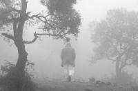
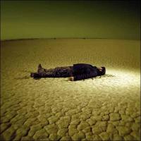
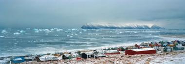
I particularly appreciated the characters and trees emerging from the Arabic fogs by Aziz Ayash; the opposition between traditional and adolescent camouflage of manga lovers in Zeng Han and Yan ChangHong work; the gigantic prints of bicycle and corps falling into water of Wang Ninde; some of the fake death photographed by Gerardo Montiel, but obviously this was clearly in super-classic Holga style. I envied Luo Dan 18000-miles-travel on the 318-street that runs through China. I can only imagine meetings, landscape and incredible location he had the opportunity to live. I admired the beautiful images of Paranapiocaba, the ghost village constantly immerged into fog, by Lucia Guanaes; the splendid artic panorama by Tiina Itkonen, which awakes in my chest location, sensations and ices that I do know; the Syrian landscapes of Mohammad Haj Kab, who feels like a failed painter and regrets not to be a Bedouin or peasant.
Here’s are three more author that I was deeply enthusiast from:
- Mehrad Naraghi and his nightly nightmarishly landscapes; dark atmospheres and blurred pictures, confused images that seems to be overexposed. Skeleton trees emerge from the darkness, tending their claws towards the far lights of the cities under the embrace of terror. The walls seem like moving, trying to run away. Reality falls into pieces on the spectator. Images are expressive and intense, and finally the language I was criticizing ahead has a precise and functional aim.
- Wang Gang realized an impressive reportage on old and young people of the Yi ethnic group. Here’s the example of a brilliantly communicative photography using only the instruments proper of this media. The fascination of this artist is not about the interventions that scramble and dirty the image, rather about the terrific intensity of his subjects, the moments he caught, the right expression, the perfect framing. The result is pictures that will be in eyes and hearts for a long time.
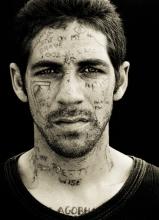
- Least but not last, Armin Pflanz photographed the prisoners of Cap prison, in South Africa. Scarfaced or tattooed man faces where writes are a geographic map of the suffered and inflicted violence. Eyes that pierce the paper, images that directly strike you. It is getting rarer and rarer to see something like this.
In the complex, except for a certain mannerism in the background, it is a fine exhibition that allows to see non-occidental photography, to discover unknown authors that reveals often a wonderful surprise.
]]>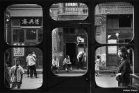
© Marc Riboud
I casually came into a text wrote in spring 2004, after a meeting with Marc Riboud.
Despite my innocence against the exhibition, the photographs and the quality of prints, the pages that mention some moments of the conference remains in many ways interesting and current. Marc Riboud is an author that I have always deeply estimated, whose simple and sincere words were a wonderful lesson in photography and life that even today I continue to repeat to myself. I then decided to publish the text in its entirety.
It’s five o’clock in the afternoon. I just finished a huge part of programming and I should start a new chapter. I close my Linux session some hours in advance and I go out into open air.
There’s a veiled sun but, after the intense rain of the past days, it’s a new born. It’s hot. Parisiennes have that kind of elegant charm and their naked, white legs put something heavy in the middle of your chest that you can’t swallow.
I took the 67, but there’s traffic jam and I immediately get off, the Maison Européenne de la Photographie is not far away. Every Wednesday, between 5 pm and 8 pm, the access is free. The other day I read on À nous Paris, one of those free dailies distributed at the metro, that there’s a retrospective about Marc Riboud and a meeting with the author at 6 o’clock.
MEP is in a quiet and sunny street of Marais. At its entrance, a stones Zen garden welcomes the visitors. The left half is composed of white stones and the right half of anthracite black, with a long, soft line between the two colors, waves and little mountains around them. Meditation garden, says the caption.
The exhibition is large and complete. One or two-hundred pictures in the most different sizes, from the littlest square that you must lower on to look at, to the blow-up one meters per two. Lots of pictures are from the 50’s, 60’s and 70’s up to now.
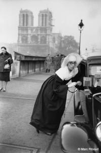
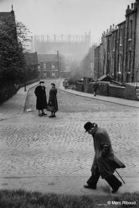
There are a lot of pictures from the Orient, with fabulous and unrepeatable subjects. There are also the famous ones, the girls caresses the marguerite against the bayonets, Le peintre de la tour Eiffel… and an inedited reportage about Leeds, that is said to be the saddest city of England, with smoky pictures of chimneys and serial houses, empty and desolated streets. Robert Capa suggested Riboud to go to England, meet girls and learn English. He says he didn’t do anything, but came back with hundreds of pictures. When he heard about the death of Capa, he lost and forgot all of the pictures. They’ve been found last summer, fifty years later, closed in a box.
There’s a good percentage of vintage prints. As everyone knows, the old paper contained more silver than the modern one and blacks were deeper and more intense. Prints are incredible; shadows are intense and large, however details can still be noticed. They are never flat. Then, here and there, some lightened faces, hands or subjects of the composition. As in antique dark and black paintings, where faces were illuminated by the light of a window or candle; and it seemed like it was a strange divinity that donated forms and expressions.
I can’t understand how can you have such contrasted pictures, where light carve only the centers of interests, leaving the rest inside the right atmosphere, which wraps up and creates the background to shine on.
Pictures are often shot without light, inside, with high contrast, besides they do not have burnt lights or flat shadows. They seem paintings, watercolors or prints. And they all scream out loud. They have an exceptional content and message, you can’t be indifferent, they hit your eyes as quick as you put your eyes on, even if you’re not able to look at.
I feel like I have throw my OM2 inside the Seine and dedicating to something else, it doesn’t worth while.
The auditorium is in half-light, with long purple drapes that run down to the floor and comfortable upholster armchair. The old photographer and the interviewer sat down together at the table.
She is thirty, copper hair clearly tinted, glasses, strong lipstick. She talks with monotone voice, using big words that I hardly understand, as French peoples never use them. Probably she studied and learned the lesson by heart, in every detail. She remembers dates and events, she knows locations and publications, she quotes with competence.
He is old as a grandpa, with light and luminous hair. His hands visibly shake and I do not understand how can he still take pictures. When he drinks, he almost drops the water out of his glass. He starts phrases but doesn’t know how to finish; he’s a little bit deaf and slow, relaxed, spontaneous. He is a seducer; he is gallant and admirer. He is funny and humorous, he makes lots of bright jokes and everybody’s laughing. He has us in his hands.
She asks complicated questions, almost untimely, impudent. He makes a witty expression.
-Well, you know… a responsible photographer? Responsibility means justice… architects, doctors… my life has been a long enjoying, qu’ai-je fait depuis soixante-dix ans sinon m’amuser ?
But she insists, quotes prizes and rewards. A photographer like you can’t resume his entire work as pure and simple divertissement.
-Aw, the winning books, yes… I forgot about them couple of months after the prize, I could have never thought about talking of them forty years later, here with you… how can you remember them? Yes, I had something like a school diploma, which I obviously forgot somewhere…
He talks about school, about an eight-days punishment and about how this castigation struck him more than the award she was talking about. But the redhead woman can’t believe it, how can someone enjoy taking pictures and nothing more? How can you live without intellectual rigor, without huge words about this sublime works? How can you live without all the theories she learned in her academy? There must be an identity, style, aim research…
-No, you’re wrong. It can’t be searched. If you search for something you end up finding anything. You just walk and walk and walk, growing up your eye. French wants to put intellectual terminologies everywhere, but eyes are not made to think. Eyes are to look at.
But she doesn’t accept the gags. And she goes on and on, with her extenuating research.
-Look, is like you try to analyze love. How was love? Better before, better after… and so you destroy everything. You loose all the poetry Miss. Because if you ask, then you stop loving, you stop doing it…
Finally she’s beat and Marc Riboud for once doesn’t shake his hand while questioned. He talks about travels and places. He can delight you with what he saw, dark, degraded, poor China. You sit down in your comfortable armchair, dreaming about prostitution, criminality, corruption. You see young people with naked foot pulling rickshaw, rain pouring and poor district in front of your eyes.
-Danger attracts men as belles filles do.
And then he prolongs about his way of shooting and intending photography, which I completely share. Simple and modest. He explains that there’s no country or travel, but there’s a way of seeing things that makes any difference. How and why exercise? No one can say it. It is matter of instants, it is the instant that worth the while. Photography is nothing but catching the moments, even in landscapes, because wind changes and sun goes down. Pictures are not reality, rather are took from an instant of reality. Time, looks, unconscious: this is what creates your stile, more and more. Unconscious must be cultivated to see. The architecture of the image is the starting point, its shape, composition, line and prospective. You should try to compose a story, your own story, in a fantastic but spontaneous architecture.
Eyes are not made to think.
Spontaneous? Not thinking? The girls starts an bright spiel about maximum systems, arts and philosophy… He immediately stops her:
- What are you doing, recite a poem?
She’s defeated, he makes fun of her without pity, gently and entertaining, but he says everything to her face. He says she’s got preconceptions but not him, a person that simply walks around taking pictures of beautiful things, that’s all.
-It is astonishingly simple.
He takes a jetable and shots a picture of us, without even frame.
The sun went down and outside, although the season, there’s a gelid wind. I walk away with excited mood, with pictures and stories in the eyes and memories of Marc Ribaud in my heart. I’m going head lower, almost without looking around, if not for some of those photos made with the mind, and enjoing the city and its people in the evening that turns to the evening.
]]>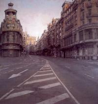
© Antonio López García
A couple of weeks ago I visited for the first time the exposition Correspondences by Víctor Erice and Abbas Kiarostami. Since that day, I came back two more days and I will probably do it some more. The pass for the Pompidou center lets you visit only one part of the exposition, without the need of running or staying inside the museum for an entire day. Well, the perfect dimension for my intentions.
I don’t want to describe the exhibition, many critics and comments are available on line. I’d like to report some personal impression though, and I think at the end it is the interesting part. In any case, the exposition will be at Pompidou until 7th January 2008.
When a gentle wind blows on a pile of white papers
I got inside the center on the defensive, because even if Pompidou is one of the most important museum of the world, sometime it offers the most boring expositions ever, they could almost not be visited. Contradictions of the contemporary art…
I avoided “The art of childhood”, as I’m not a lover of extracts, anthologies and actually not even children. But I did admired the poetical Alumbramiento, so delicate and refined, with a wonderful black and white picture. That emotional singing that magisterially closes the short movies, from the antique scent, as it would be a universal hymn that we all recognize.
I then got inside the room where the “notes” of the documentary about the painter Antonio López García were projected. I looked at them with a mixture of interest and a little of tediousness. Interest, because the documentary explored many themes conceptually fascinating. Tiresomeness because I still had before my eyes the images of the short movies, the emotion of the singing that was still resonating inside and the crude style of the documentary left me empty handed.
This is myself; the concept can’t touch me if it’s not followed by emotional and aesthetic strong contents. The majority of conceptual artists try to completely take off all the expressive, not cerebral contents from their works. I understand it, it is a coherent choice. But I’m not able, and most of all not interested. I can’t live without poetry. I can be intellectually involved in a philosophical debate, I can have a position, play my part, but I will always need pointlessness, I will always have the sensation that I will find what really value somewhere else, out in the street, among people, during wars. I get quickly bored from intellect, brain or theory if not accompanied by a message that can reach the most sensitive part of us, in that vague territory of hardly explicable but highly recognizable sensation. It is only important if ça sort des tripes, as French say.
Except for this polemic divagation, videos were interesting and I looked at them with attention. Because I got some reminiscences of Antonio Lopez from that kind of Spanish culture learned by Ana, her family and my trips in Spain, and because it is fascinating to see an artist at work, is something that rarely happen.
Usually paintings are shown and put on a wall only once finished, immortalized in a condensation of space and time that the final work represents. See the painting while painted, see it while taking shape, take away its first characteristic, which is being the summary of all the time it took to paint it, to give back the progressive dimension that created it. Moreover this is a particular point for Antonio López, because he often work on the same painting for years, not to say decades, overlapping continuously the brushes and condensing the reality of the subject on the canvas, to constitute a sort of concentrated essence of reality, which goes further than the subject itself, it is the idea of the subject, it is the thickest representation of the noumenon he can give.
I was just thinking about this fact when I started walking toward the next hall that -I read this only the second time, when I came searching for those sensations- should contain “the tumult of the world, the silence of picture”. The most correct title.
A room full of shadow, almost dark. Desert and completely empty, but a wall with an enormous window. At the center of the windows there was, unique work of the entire room, the painting “Gran Via” by Antonio López. The same as the one Erice used for his video that I just looked at, video where the director put the camera in the exact point where Antonio López put his easel years ago, same framing, same place but this time there’s no urban view in front of our eyes, rather Madrid with its cars darting inside Gran Via, lights on and off during the night, noises that animates every metropolis. You enter the room with all the movie images in front of your eyes and suddenly the real paint is there.
For a moment I strongly felt a fearful slipping of reality. Everything mixes inside my head, with violence. All the different plans of reality, of its representation, fall apart and loose their significance. I don’t know where I am, I don’t know if I’m looking to Antonio López painting, if I’m in the middle of the street with all the cars running near me or if I entered the pictorial concentrate of the Gran Via essence. I don’t understand if I’m looking at Victor Erice video, that represents my memories of Madrid and its principal street, the Gran Via Antonio López looked at while painting or the one living while Victore Erice recorded.
Where am I? Which is the real world?
How many realities, how many plans of knowledge, usually well piled in our taxonomic occidental system, suddenly flew away, as wind that suddenly blows a pile of papers away in a room, without bottom or top anymore; in front of the eyes only a whirlwind of white pages. Around me, the world is breaking into thousands of pieces, I feel like falling into nothingness and Montale’s poetry occurred into my mind with glacial lucidity:
Maybe one morning, walking in dry, glassy air,
I’ll turn, and see the miracle occur:
nothing at my back, the void
behind me, with a drunkard’s terror.
Then, as if on a screen, trees houses hills
will suddenly collect for the usual illusion.
But it will be too late: and I’ll walk on silent
among the men who don’t look back, with my secret.
For a short moment my head spun; the museum around flaked off, for once I had jumped out of the matrix without choosing the red pill to discover how deep is the White Rabbit den. The veil of Maya suddenly came down as a veil that furls and cover the entire jetty of a ship, avoiding the sight of the entire sea.
It was one of those moments when reality totters for a while and you feel like you’re on the edge, one step away from illumination and madness, near near to slip, and the only thing I can say in my defense is that it was fucking well-done, with all the sounds recorded in Gran Via on the background and a wise play of light on the paint to re-create the dazzle of cars. They enlightened the fuse then I blew on it…
I came out with goose bumps and a huge turmoil inside my chest. One of the strongest aesthetic-emotional experiences of the last years. I hope it is clear now the reason why conceptual art often leaves me cold.
There’s no life without poetry.
Those special rainy days
At the center of the exposition there’s actually a projection of the correspondence between Erice and Kiarostami that is the title of the exposition itself. Looking to the short movies, the nature of the identity and direct relation between the two (that is the sense of the exposition) is cause of doubts. There are surely lots of affinities but also differences, so why did the organization proposed a circular and mirror path instead of restricting itself to underlining similarities and divergences? I think that for the central part of the exhibition it is better to take this four hands work for what it is: a collection of animated letters, often stunning, between two great personalities of the cinema.
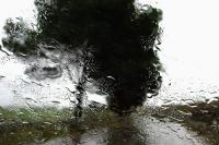
My favorite “letter” is absolutely Kiarostami’s about rain. We’re on a car, moving in a rainy city. There’s water running on the windshield, there’s lights of other cars, trees and houses have shaded contours. Abbas is talking, he says that maybe we do not know, but in Iran it rains only some days in spring and some days in autumn, and that’s the reason why Iranian always have some beautiful memory related to rainy days. He usually travels all alone, but this time he wants to be with Erice.
And here’s a slideshow, substituting the video, composed by all the pictures took inside the car, a piece of classical music on the background. They’re all pictures of the wet glass. Drops draw regular elements, long streaks when pushed by the speed, huge pools when the tension is superficial. The panorama saw through a glass like this, with its infinite game of diffraction and refraction, turns into a splendid impressionist paint. That shaded but so vivid atmosphere, it was like being there, like perceiving exactly the light that covers things during rain, like feeling the sensation to travel by car in that particular way. It often seems to look at real brushstrokes, sometime tree brunches roll into balls as Van Gogh features. Wonderful, poetical, sensitive. Images are so intense that they made me cry.
Some steps forward and the same pictures are printed and hang at the wall. I was a little disappointed; they are grey and flat. Well, I do know rainy days are grey and flat, or probably I saw the effect of a projector that uses the wrong output and twist the gamut (did Pompidou really made such a terrible mistake?). Although it could have been a case, the effect in the video has been magnificent and superior to the “correctly” printed pictures. The excessive contrast turns them into magical landscapes; transmission instead of reflection tops them up of light, turns them into abstract paintings, improving the expressive impact a lot.
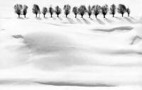
Between all the things I have to notify about the exhibition, some wonderful fabulous Abbas’ pictures about trees and snow. Clean and essential, marvelously printed in huge format. Washed and blinding whites, dark blacks are pure signs, calligraphy on snow.
Real pleasure for eyes.
]]>


