Resin coateded inkjet prints on artistic paper
The first person that talked to me about resins coat on inkjet print on drawing paper was Marco Tardito (whom I also made an interview).
In the past I also tried myself printing on watercolor paper with my Epson 2100, but the results were terribly disappointing. Colors are completely wrong because standard profiles doesn’t work on artistic paper and black are almost grey, therefore the contrast is strongly flattened.
If the first problem is kind of easy to be solved, you just need a calibration device that creates custom icc profiles, the black problem is more complex. At its basis there’s a problem of excessive absorbing of the ink from the paper, expanding in its fibers and giving back flat and without blacks images. The ideal solution would be covering the background of the paper with a layer of some material that doesn’t allow the penetration of the ink. Well, in practice the paper for inkjet printer should be created at home. More than all of the sizing techniques, there are also pre-prepared products, such as Inkaid, a sort of paint which I was talked by Dorothy Simpson Krause in her interview and that, at least the producers say it, allows to print on each support.
It is a pity. Using fine arts papers is a very attractive idea. In general those papers are much more beautiful than the one for inkjet print and there is also an enormous, almost infinite variety with different characteristics available.
I then got in touch with Marco Tardito and I was talked about a second possibility, that is painting after printing. After some time he brought to me in Paris some wonderful prints of still life (wonderful pictures as well) on paper like Rives BFK, heavy and textured, which means sponge for ink. Although this, black were the most lucid and deep ever, the prints brilliant and contrasted. A thick layer of transparent paint covered the surface, as some millimeters of plastic resin would have been poured on it (actually, the layer was thinner, but that was the impression). The irregular surface united the beauty of the paper with the beauty of hand-made objects. The only problem, in my opinion, was the horrible synthetic smell and an interrogative point on the print conservation in time.
Marco Tardito confessed me about his countless tests on paper and resin to find the right combination, therefore I tried myself. Seen the results, I’m far away from Marco’s wonderful prints, but I learned a lot about resins and paints anyway. Recently I’m mostly worried about photography and work than print testing, but who knows maybe one day I will take printing on watercolor paper more seriously.
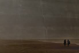
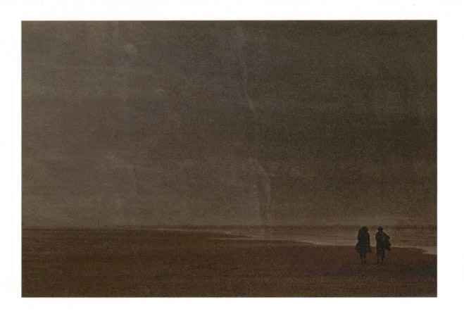
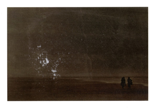
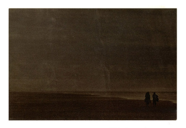
Prints have been made on Graphia paper, an amazing, not too expensive, white and smooth Sicilian paper. Testing is not rigorous as usual. I just printed 5 or 6 different images and painted each one using 3 different resins: from acrylic to Arabic gum and a polyurethan paint. The followings are some notes about the experiments and the scanning of one of the images of the series. Scansions are particularly to execute, results should better be judged in person. Pictures are only reported as guide.
Acrylic
Acrylic must be watered down, as it facilitates the preparation to every dilution. The solution has the aspect of a white viscous liquid, as a sort of vinavil diluted. It smells like ammoniac, but not so intensively. The seller told me that it doesn’t yellow, even after long periods; after two months I still don’t notice any kind of change. Half a litre costs almost 8 euros.
The acrylic, used directly at the original concentration, is really dense and thicken rapidly . It is much easier to coat the print when it is diluted one to one with water, but I’m still unable to make an even surface, without the brush streaks. Even with a dried, soft brush to smoothen the harshness, after the first coarse application (imitating the smoothing technique of the bichromate gum) it is hard to brush in a very uniform manner. When wet, the brushstrokes are white therefore particularly evident into the shadows; when it dries, they become transparent. The surface of the print keeps on being striped, evident if watching the print with a grazing light.
Probably acrylic should be diluted more and more to be scoated in an efficient manner or it must be sprayed with an airbrush. Anyway the seller told me that the less the acrylic is diluted, the more the acrylic is diluted the less the print is brilliant. Brilliance should be recovered superimposing more layers of acrylic. In this last case, we must verify that the successive layers will not soften and take away the past ones.
In about 30 minutes the print will dry, but if acrylic were working as all of the resins I used in the past, it would be better to wait some hours before the second coat.
The surface, even with some stripes of the brush, is homogeneous, in the sense that the stripes are regular and the effect can be lovable. The print is lucid and brilliant, such as the Arabic gum or the polyurethane, but I’d say blacks are less deep.
After some days, I put the prints one on the other and I put some weight on the top to flat them. All of the acrylic painted prints adhere one to each other; this never happened with Arabic gum or polyurethane. When I divided them, the part behind stuck on the picture behind. There’s no crease.
Arabic Gum
Arabic gum can be solved on water as well, and this allows all kind of desired solutions. It is a sort of yellowish transparent liquid, characteristic that should warm the tints of the prints. The gum is practically without smell; the soft aroma is pleasant and natural, remembers about craftsmanship stores. A bottle from 1 liter up to 14 degrees baume costs less than 10 euros, turning the Arabic gum into the cheapest resin between the ones I tried.
I tried it directly without any kind of dilution, as all of my attempts with gum prints, knowing it would have been too thick. It is easy to paint with; the aspect of the humid print is lucid and nice. As far as it dries though, micro-bubbles born because of the paper absorbance, micro-bubble that can’t run away because the solution is too dense, making the picture surface irregular.
Probably this problem wouldn’t exist if Arabic gum were more diluted. Another attempt could be adding some ethylic alcohol, as in the preparation of paper for carbon prints it sensibly reduces the presence of bubbles. Superimposition creates same doubts of the acrylic; I didn’t verify if other layers remove the precedents. Arabic gum could be hardened with a little addition of potassium dichromate, making it completely insoluble. The problem is that dichromate leaves a green dominant in the gum and is very toxic, therefore I rather renounce. It is useless to use gum, a natural product, when you put a highly toxic and carcinogen substance in it.
Even after a couple of months, the surface of the print is gluey if touched, but it doesn’t seem like dripping or sticking like acrylic, which is perfectly dried when handled.
The surface, from perfectly smooth, has been covered with cracks that follow the sense of the paper fibers. Although this, the effect is still delightful.
In the complex, this is the resin I prefer: no smell, natural ingredient, brilliant and deep blacks, kind of easy to spread out, centenary photographic tradition that confirm its stability during time. But most of all, looking at the pictures, it is the one that I prefer.
Polyurethane

This paint is solvable with a classic industrial solvent, not water. It is in fact greasy to the touch. Though its transparency, it has a slightly purplish color. It has an intense and unpleasant smell typical of solvents. I bought the cheapest paint I found in a DIY shop, but the price is 9 euros for 250 ml, the most expensive between the three resins I tried.
The polyurethane paint rapidly penetrates the paper. Even a large quantity is quickly absorbed. The humid paper is the most brilliant, but when it dries the surface becomes opaque. Its drawing up is easy and uniform, even with a hard brush. If, with some layers of paint, I could create the right surface that will not be absorbed, this would be the perfect resin.
Unfortunately, once the surface dries, it becomes irregular, in some zone is matte and in some others lucid. Blacks are actually deeper but the surface is very rough.
After only two months the polyurethane layer turned visibly yellow.


umberto
said, August 31, 2008 @ 11:19 am :
Io stampo da anni su carta non trattata, tipo “belle arti”.
Concordo sulla difficoltà di ottenere un contrasto adeguato e neri profondi. Risolvo in buona parta questo problema con una seconda stampa a ripasso delle zone più scure. Ho provato Inkaid, che però ho trovato impossibile da stendere uniformemente. Poichè desidero che la carta mantenga il suo aspetto naturale, evito le plastificazioni o le vernici troppo pesanti. Tra l’altro molte di queste vernici sciolgono gli inchiostri.
Attualmente stampo con ripasso, applico una vernice finale spray tipo Maimeri, Talens o giù di li, preferendo quelle di tipo lucido: la carta non diventa assolutamente lucida, ma l’immagine guadagna in contrasto e saturazione dei colori. A volte, dopo aver spruzzato la vernice, passo con un tampone uno strato finissimo di cera d’api bianca (la vendono i droghieri) e lucido con uno straccio di lana morbida; alla fine di questa avventura, ottengo immagini di buon contrasto, dall’aspetto appena serico, che mostrano chiaramente di essere fatte di carta e d’inchiostro.
Umberto
Fabiano Busdraghi
said, August 31, 2008 @ 12:27 pm :
Ciao Umberto, grazie mille per il tuo contributo.
Ho già sentito parlare del secondo passaggio nella stampante per scurire i neri, ma ho sempre sentito dire che il grosso problema è il registro fra le due passate. Personalmente, quando in un’altra occasione ho cercato di stampare due volte la stessa foto, ho ottenuto due immagini sfalsate di almeno un millimetro, cosa piuttosto fastidiosa. Hai trovato un modo per risolvere il problema del registro? Oppure semplicemente hai una percentuale di scarto? A quanto ammonta?
Quella della cera è una tecnica di antiche tradizioni, spesso gli stampatori al platino/palladio la usavano per ravvivare le stampe. Fra l’altro a pennello può anche essere applicata solo localmente…
Se hai voglia di farmi vedere qualcuna delle tue stampe mandami una mail.
Ciao
Fabiano
umberto
said, September 4, 2008 @ 6:42 pm :
Ho visto recentemente a Reggio Emilia delle splendide stampe di Steichen, platino con ripasso dei neri in photogravure.
Certo il problema del registro è importante. Le stampanti hanno movimenti molto precisi, ma l’inserimento nei rulli non sempre è perfetto. Bisogna curare bene il bordo del foglio, che non presenti irregolarità o sbalzi da taglio. Di solito lo liscio facendo pressione con un barattolino di pellicola in plastica bianca. Poi è opportuno far passare il foglio nei rulli un paio di volte per insegnargli la strada. Poi è bene introdurre il foglio con il comando di avanzamento carta della stampante e segnare a matita qualche contrassegno che verrà buono per il ripasso. Addirittura è spesso meglio stampare prima il ripasso e poi la stampa di fondo; questo per due motivi: il ripasso consuma meno inchiostro ed appesantisce meno il foglio, compromettendone meno l’avanzamento nei rulli; poi perchè se si vede che la stampa di fondo, paradossalmente sopra il ripasso, non è a registro, si può bloccare subito la stampa, evitando il maggior dispendio d’inchiostro della stampa base.
Con la pratica e l’esperienza, come recitavano le vecchie pubblicità, si arriva ad ottenere una percentuale di scarti molto accettabile, ampiamente diluita nel gran dispendio di prove, provini, pentimenti, eccetera. Il concetto di accettabilità è naturalmente legato al costo della carta impiegata. Io non uso carta esoteriche, ma banali supporti da grafica o tipografia; quando vado di lusso, uso la Rosaspina 220 di Fabriano (1,40 + IVA al foglio 70 x 100); normalmente impiego la Tintoretto di Fedrigoni o la Prisma 220 di Favini.
Ti mando una mail.
Ciao. Umberto
Fabiano Busdraghi
said, September 6, 2008 @ 3:02 pm :
Ciao e grazie per i dettagli. Quella di fare il “ripasso” prima della stampa vera e propria è una buona astuzia, il foglio lo si butterà via lo stesso, ma almeno si risparmia l’inchiostro.
Non ho capito bene come fai per il registro, fai avanzare la carta a mano nella stampante? Che stampante usi? Non avevo mai sentito parlare di questa opzione, adesso mi informo per vedere se lo posso fare anche sulla mia epson 2100.
Grazie per le dritte sui bordi. Io in generale li lascio sempre sfrangiati, perché il taglio netto non mi piace, quindi alcuni dei miei problemi di registro potrebbero andare a posto seguendo questa piccola accortezza.
La Rosaspina, anche se non è cara, è una bella carta. Le altre due invece non le conosco.
ciao e ancora grazie
f
umberto
said, September 12, 2008 @ 8:31 am :
Ti ho inviato una email e ti ho spedito degli esempi per posta prioritaria, così potrai vedere che carte sono la Tintoretto e la Prisma. Per quanto riguarda la messa a registro, appoggio la carta sull’introduttore posteriore, sopra un cartoncino dello stesso formato del foglio, poi premo il pulsante d’inserimento carta che si trova su tutte le stampanti che conosco, Epson ed HP. La carta viene presa dai rulli, avanza fino ad un certo punto – circa 1 cm. oltre i rulli – e si ferma. Apro il coperchio, che per la verità tengo sempre aperto quando stampo, e segno a matita sul foglio una o più tacche di riferimento in corrispondenza dei rulli. Poi dico una preghiera e lancio la stampa. Uso tre stampanti Epson 1200, 1270, 1290 ed un plotter HP Designjet 130. Tanta dovizia è dovuta al fatto che per metà dell’anno vivo in una casa fuori città e non me la sento di organizzare un trasloco ogni volta.
Aspetto la tua opinione sulle stampe che ti ho mandato.
Ancora ciao. Umberto
Fabiano Busdraghi
said, September 12, 2008 @ 9:31 am :
Ok, ho capito. Inizialmente pensavo che usassi il segno di riferimento per allineare a mano il foglio, invece lo usi semplicemente per verificare se questo è entrato correttamente oppure no. Nel primo caso lanci la stampa nel secondo invece immagino che ripeti la procedura. Anche questa è una buona idea, grazie di condividerla qui, su camera obscura.
Grazie infinite anche per l’invio, aspetto con impazienza le stampe.
ciao ciao
Fabiano
Camera Obscura » Intervista a Marco Tardito
said, October 15, 2008 @ 8:52 am :
[...] Una volta stampata l’immagine su carta da disegno, gli inchiostri sono però assorbiti in profondità, per cui devo utilizzare delle resine per riportare in superficie il colore. Come del resto hai spiegato nell’articolo Vernici per stampe a getto di inchiostro su carta artistica. [...]
marko
said, November 11, 2008 @ 10:25 am :
[aggiornamento]
Ho dovuto rivedere alcuni materiali che utilizzavo perché ho notato che se vengono utilizzati senza o con poca diluizione, la immagini tendono ad ingiallire troppo.
Mi sono recato da mr. Sennelier , il quale mi ha consigliato un prodotto a base acrilica, Golden , gel medium (25,37 euro per 473 ml ! ).
Ho potuto fare delle prove e comincio ad avere buoni risultati , a parte l’ingiallimento che non dovrebbe essere presente, anche se è presto per poterlo dire.
Se volete fare delle prove , vi consiglio di dare più mani molto leggere diluite con acqua, fino a raggiungere la densità lattea, non oltre.
Se date una mano troppo spessa, il prodotto non riesce a penetrare in profondità e le stampe resteranno opache. Dopo un paio di mani è possibile aggiungere gli effetti di rilievo che il gel permette.
Ho notato ad una mostra di Sarah Moon che alcune stampe a colori su carta con grana avevano un effetto “perlato” ottenibile con questo prodotto dato con una sola mano in modo uniforme ( forse con un rullo ).
Se ottenete risultati interessanti con prodotti diversi, aggiorantemi.
Ciao
Marko
Pinholeswap 2009: scambio di foto stenopeiche e zoneplate
said, January 14, 2009 @ 4:17 pm :
[...] per rinforzare le ombre, come mi è stato gentilmente suggerito nei commenti dell’articolo Vernici per stampe a getto di inchiostro su carta artistica. Per saturare i neri e rendere la foto brillante ho verniciato la stampa con una base per pittura [...]
Heidi
said, June 18, 2009 @ 2:35 am :
Thank you so much for translating this article. It makes such a difference to be able to read what other people have tried to overcome this problem. I have not been very successfully with my attempts so far and the only varnish that has worked (the image has not faded over a couple of years on the thick paper) was a varnish from a spray can to fix your drawings. But I am not confident that it will work over 10 years or even more, but maybe we do not need to worry this much. I would also be interested to find out if anyone has tried bees wax? I imagine it would bring out any colours of the image and highlight them, but… I might be wrong. I also really like the image you have used.
Intervista a Marco Tardito
said, March 21, 2012 @ 12:48 am :
[...] Una volta stampata l’immagine su carta da disegno, gli inchiostri sono però assorbiti in profondità, per cui devo utilizzare delle resine per riportare in superficie il colore. Come del resto hai spiegato nell’articolo Vernici per stampe a getto di inchiostro su carta artistica. [...]