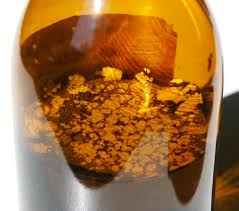
Fine silver flakes float on the surface of a Van Dyke Brown solution”
Lots of Van Dyke Brown printers lament that a precipitate form inside a Van Dyke Brown solution, obtained during the preparation of the solution itself, or more precisely just before finishing to add C inside A+B, following the conventions and quantities of the VDB classic formula like the Wynn Whyte style says.
Not everyone obtains this precipitate and the principal reason is that ammonium ferric citrate is not a well-defined chemistry substance. (go to Mike Ware page for same examples), that means it changes from distributor to distributor and often from bottle to bottle.
(more…)
Here a brief description of the formulas and proportions that I use to get the classic solution Van Dyke Brown and a modified one to prevent the deposit of silver salts.
(more…)

Adox negative reduced with Eder’s harmonizing reducer. Please notice the apparition of three horizontal marked bands and a fine vertical weft. This last was present also before the reduction, while the bands where invisible while printing and only appeared after the treatment.
Compared to digital negatives, analogical negatives adapt more easily to the used techniques, allowing a larger margin of interpretation.
Digital negatives are precisely calibrated on an ensemble of constant variables. They practically function correctly for a certain type of paper, sensitizer, drying, etc… But they give bad results when changing those parameters, even for little changes. The consequence is that digital negatives are useful when a standard for a certain technical paper is established, but while searching and experimenting is easier to use an analogical negative, which better accomodate the variations of the printing technique.
It’s the reason why, even if in general I print using digital negatives or little contacts taken from 120mm negatives, I sometime prepare enlarged negatives. The procedure to obtain it is long and complex, lots of tests are required to learn how to obtain a negative perfectly adapt to a certain print technique.
(more…)

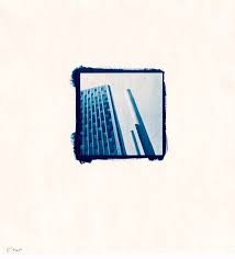
Near the Gare de Lyon. Cianotype 6×6cm on Schoeller Durex 17×17cm paper.
Some weeks ago, talking with famous French palladium printer Jean Claude Mougin, we started discussing about cyanotype print hue. In that occasion, he said that when cyanotype tends to violet is because paper is probably basic and could contain a buffer of carbonates. As is common knowledge, cyanotypes prefer an acid environment and preserving them in a basic environment could harm their life span. Therefore, it should be better to avoid basic paper.
I tested several cyanotype papers and cheap drawing papers are my favorite; the nice watercolor paper, neutral and 100% cotton, gave inferior visual results. In particular, drawing papers have a violet tone that I found more agreeable than the cyanotic of the more noble ones.
Therefore I suppose those papers contain a buffer of carbonates and this could harm the life span of prints.
(more…)

Andrea. Posterized cynotype by tea toning and sodium carbonate. Fabriano Artistico Paper gelatine sized, salted and pre-acidified in citric and acetic acid. Paper and image size: 19×28,5 cm. Unique copy.
It is known and decanted the importance of taking notes and conform to standard all the procedures when working in dark room, mostly when working with antique techniques. But sometimes it is funny to let yourself go and dare. The majority of the prints will be thrown away, but sometime you can get unique results that you would have never been able to obtain if following the known ways. Something you’ve never seen before, because it is born with the help of destiny.
This is the history of one of those images.
Couple of years ago, far 2004/2005, I was fighting with salted paper, and I couldn’t print more than a pair of decent images. I couldn’t understand which was the variable that stonewalled. I was testing several types of paper, sizing, hardening… I found the right combination for a great result, I prepared 20 sheets with as much attention as I could, but in the end no one was working. There must be some kind of variable that I couldn’t control that was making fun of me. The result was nothing but tons of lost hours and lots of paper ready to be sensitized and left in the dark room to get older.
(more…)

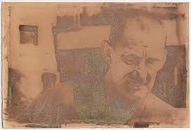
Roscigno Proloco guardian. Original file used for VDB and pigments print.
A couple of years ago I printed some VDB on pigmented prints. It is a color print, obtained overlapping a ferric salts black and white print on a cyan-magenta-yellow inkjet print.
I think that one of the first photographer who used this technique has been Dan Burkholder, whom website contains wonderful platinum tirages with delicate pencil color. Ron Reeder proposes wonderful and similar images on his website too, where a detailed manual explains how to obtain those kinds of prints. These two authors prints on platinum instead of silver, but the technique is exactly the same.
The result I obtained in 2005 was nice, but far from Burkholder and Reeder’s. Colors vaguely remembered old handmade postcards spread in the first half of the 20th century, but their problem was brilliant pinks and pale greens in highlights, surely too saturated and luminous for me.
(more…)

Blue print of the series “Il vuoto che mi hai lasciato”, size 6×12cm on Bristol 10×12cm. Cyanotypes have deep blacks on Bristol 350g, they are brilliant, detailed, highly contrasted. The color is a pleasant deep blue, almost violet. The loss of the image during the washing is minimum, therefore the effect of granularity is much contained.
During last weekend I personally tested several types of paper to print in cyanotype.
Requisites for cyanotype paper
The paper must satisfy all the following exigencies.
It must produce deep and almost black blues, not pale or washed-out light-blues. This is essential to get brilliant and bright blue prints, which would be consequently rather flat.
It must have a satin surface; as I’m contact printing 6×12 negatives, fine details become absolutely fundamental.
It must have an important weight to ensure flatness after coating. Papers whom embark too much, even if bone dry, gets the adherence with the negative hardly. On a textured paper can also not be a problem, but on a satin surface sudden appear an unpleasant spot flou.
The image does not have to fade during rinsing. Cyanotypes normally loose density during this phase. Some types of paper though release some filaments of blue during the first minutes of washing. This generally produces a granular and irregular aspect, it makes necessary longer exposition and commonly generate less fine images.
(more…)